


CSS 파일을 불러와 적용하는 방식을 익스트널(external)이라고 하죠.
미디어 쿼리를 link태그에 적용해 해상도별 불러올 파일을 고를 수 있습니다.
<link rel="stylesheet" media="(min-width:0px) and (max-width:500px)" href="파일경로" />
<link rel="stylesheet" media="(min-width:501px)" href="파일경로" />
제가 미리 2개의 CSS 파일을 만들어두었습니다.
0 ~ 500픽셀 까지는 다음의 코드를 to500.css파일로 저장했습니다.
p{color:hotpink}
501픽셀 부터는 from501.css파일로 저장했습니다.
p{color:skyblue}
다음은 미리 만들어둔 2개의 CSS 파일을 테스트하는 예제입니다.
<!DOCTYPE html>
<html>
<head>
<meta charset="utf-8" />
<title>media query</title>
<link rel="stylesheet" href="./cssReset.css">
<link rel="stylesheet" media="(min-width:0px) and (max-width:500px)" href="to500.css" />
<link rel="stylesheet" media="(min-width:501px)" href="from501.css" />
<style>
p{font-size:20px}
</style>
</head>
<body>
    <p>everdevel</p>
</body>
</html>
위 코드의 결과 - 0 ~ 500

위 코드의 결과 - 500 ~
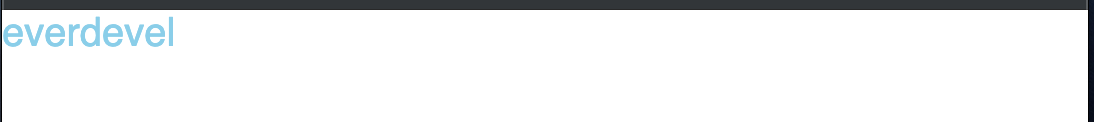
해상도별로 다르게 적용됨을 알 수 있습니다.
봐주셔서 감사합니다. 문의 또는 잘못된 설명은 아래의 댓글에 부탁드립니다.
당신의 작은 누름이 저에게는 큰 희망이 됩니다.

댓글 0개
정렬기준